The Starpack Students competition is an opportunity for the next generation of packaging designers to showcase their ideas and solutions directly to an industry looking for rising stars. This year the Metal Packaging Manufacturers Association (MPMA) has sponsored Brief A to design a gift pack for gin.
Gin may quite possibly be the world’s most-loved spirit. While the gin craze may have begun with more classically juniper-driven flavours, there are now a delectable array of gins to explore, botanical, herbal, spice, floral or fruit-flavours or often a combination.
In this post, we also look at our top tips for designing with metal.
The 2021 brief – designing with metal
This year’s brief is to design and develop a metal gift pack for either a single bottle; two or three bottles of any size or shape; or a mixed gift pack of a bottle of gin with related items. Students should create a fictitious brand reflecting the heritage, flavour and quality of the gin.
The pack should be designed to be sold in retail outlets spanning duty-free areas at airports, high end, high street stores and specialist drinks stores or via online shops of individual distilleries. Students will need to develop the name, bottle label and most importantly the secondary metal pack.
Further points students need to consider include:
- The secondary pack should be designed with a potential after use
- The focus should be on the secondary (metal) pack rather than the contents
- Embrace the gift purpose – the recipient’s anticipation in opening the pack
- Decorative possibilities of metal i.e. high–quality graphics, specialist print finishes
- Shaping, embossing and debossing possibilities of metal
- Innovative and creative branding and design reflecting the product
- Shelf impact and consumer appeal
- Functionality of the pack
- Suitability of the pack for after use
Trailblazing packs
Although alcoholic drinks are regularly found in metal secondary packs, gin brands are less usual.
However, this year the team at CROWN Aerosols and Promotional Packaging Europe worked with Fishers Gin to design a secondary metal pack which has so far scooped three packaging awards this season including Metal Pack of the Year – Promotional, Decorative & General Line at UK Packaging Awards; Can of the Year by the Canmaker Magazine; and Best in Metal by MPMA.
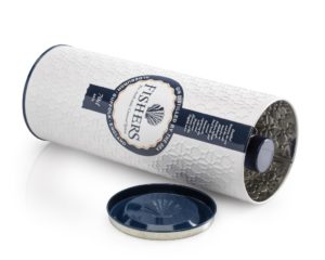
The striking design on this secondary pack captures the coastal spirit of Fishers Gin and of its Suffolk provenance. With a white background with blue and orange hints, the pack’s colour palette was inspired by fishing boats found in the area whilst detailed embossing across the tin body emulates a traditional fishing net.
The Fishers Gin pack, designed to house a matching 70cl bottle, stands out on shelf and its tactile finish creates a memorable experience for consumers from the start.
We spoke to Corrina Korrubel, one the award-winning designers behind the Fishers Gin pack for her top tips for students considering this year’s Starpack Students Brief A.
Top tips for designing with metal – Corrina’s top tips:
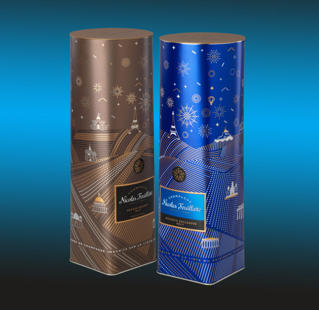
- Firstly, consider what metal has to offer – it affords a second layer of protection for your product but also provides additional creative canvas to display your brand. Think about how the two ‘layers’ interact with each other. On this Nicolas Feuillatte Champagne tin, the lid has special indentation to hold the interior bottle in place, removing the need for any additional inserts.
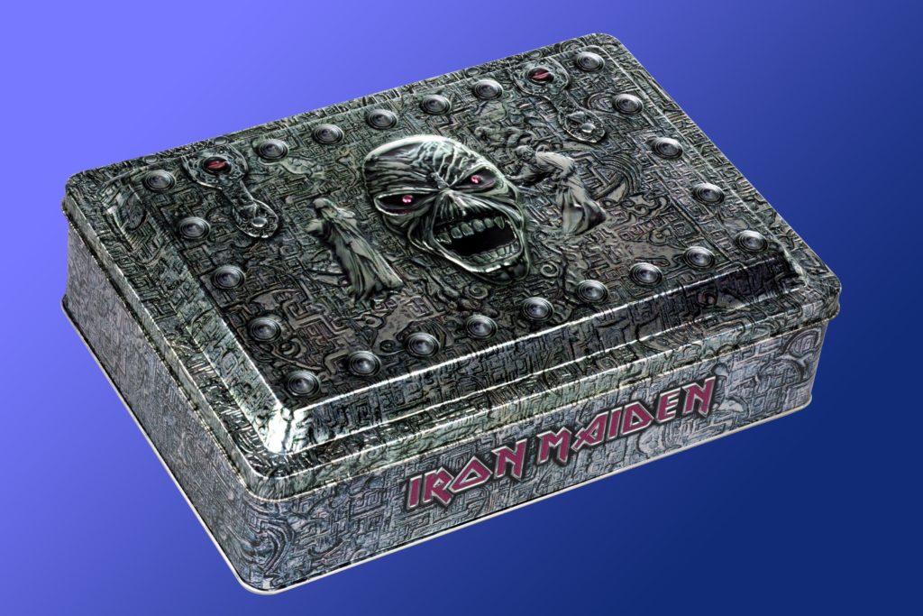
2. Metal, unlike other materials, provides you with a metallic substrate – use this to your advantage and build layers of colour on top of this. This Iron Maiden tin is a great example – the metallic dark background really adds character.
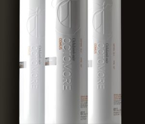
3. There are also a good range of special finishes such as matt or gloss, transparent and opaque inks, glitter, holographic or even sparkly. Imagine how you could use these to full effect. For more information on these visit: https://www.crowncork.com/design-inspiration/flat-sheet-decoration-options On this Octomore Whisky pack, pure white print ink is combined with an emboss which highlights the brand name.
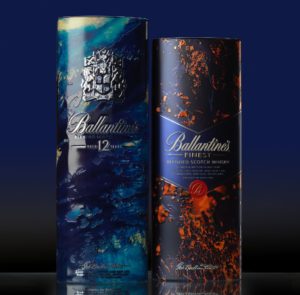
4. Treat every tin not as just a functional item but as a work of art. Tins provide a wonderful creative medium. On this Ballentine’s Whisky tin two essential elements, fire and water, required in the whisky making process are printed in vivid colours creating an eye-catching pack.
5. Embossing, debossing and micro-deboss are also finishes specific to metal. They allow designers to highlight specific details and can include large areas or detailed textures. Fishers Gin is an excellent example, where we embossed the criss-cross pattern of a fishing net.
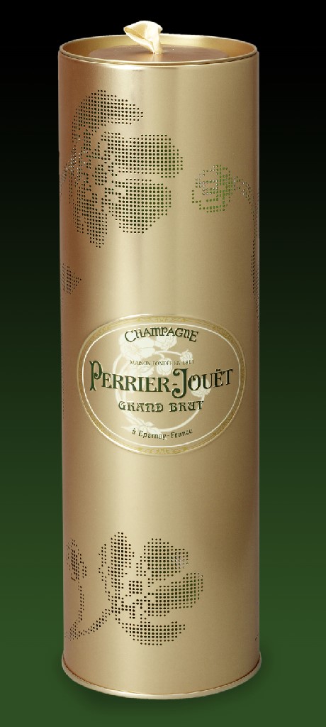
It is also possible to incorporate windows, perforations and cut-outs into metal packaging designs like this Perrier-Jouet tin.
6. There are many aspects to secondary packaging so do think about the inside, as well as the outside, top and bottom. It is possible to print the inside of the tin as long as there is no food contact – as is the case with a gin bottle. 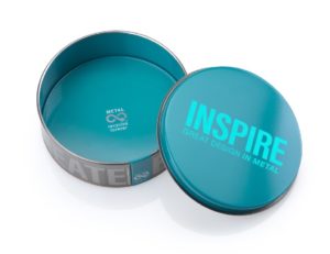
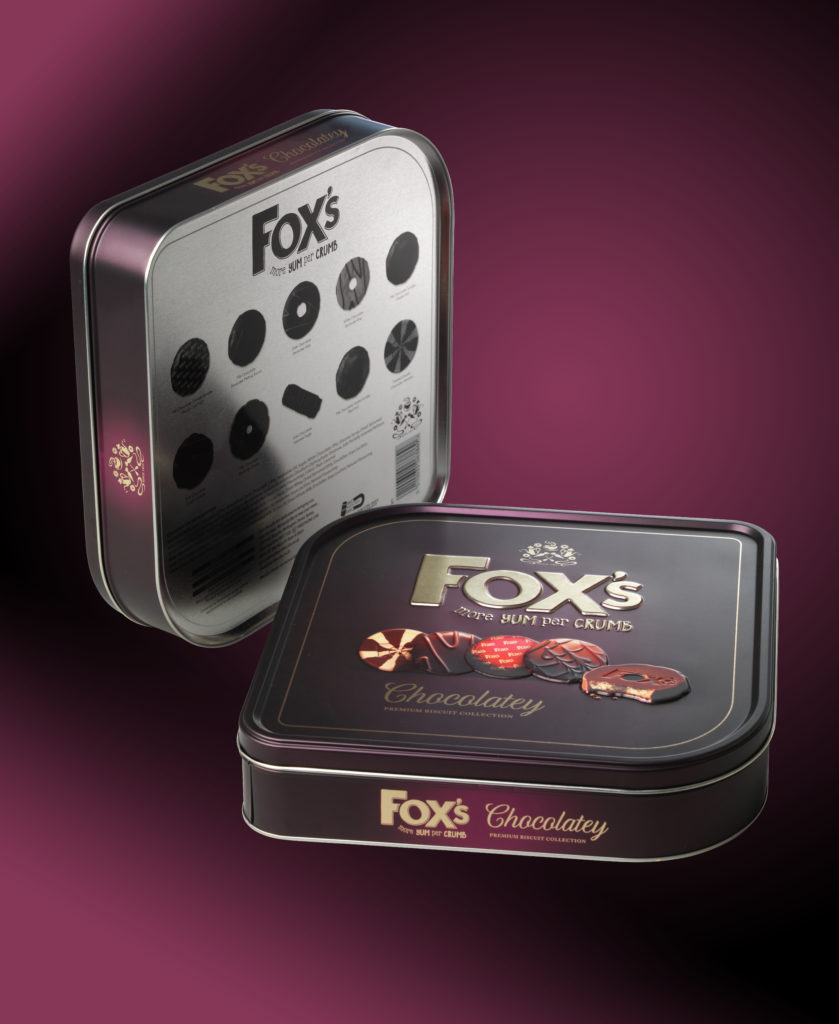
7. Shape and form are also important features of an award-winning tin. As well as round and square, it’s possible to create unusual shapes such as this Fox’s Biscuit tin.
8. And lastly, think outside the tin! We always work from blue sky designs, which are later honed through full feasibility studies and methods of manufacture at the next stages.
